Loading
energyhill
  • about
  • work
  • industries
  • services
  • blog
  • resources
  • contact
  • e
  • i
  • t
  • f
  • Menu Menu

Presidential Candidate Logos: A Design Review

Insights
Presidential Candidate Logos
The 2016 election is gearing up to be the battle of the logos. Following are my evaluations of the top democratic and republican contenders’ logos, each one graded for its use of color, shape and font.

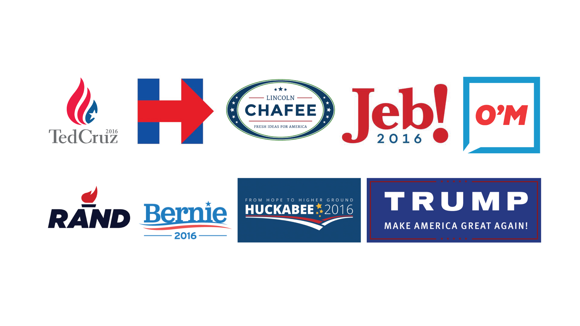
Democratic Presidential Candidate Logos

Hillary Clinton

hillary-clinton-logo
The Clinton campaign has created a simple, strong and straight forward logo to represent Hilary. The logo has a good sense of movement and direction, moving us to the right made with the arrow.
 
Shape: A
Color: B+
Font: B+

Jim Webb

jim-webb-logo
The font is distributed oddly across this logo, and the star on the “i” it looks too little compared to the font size, but the overall shape is solid.
Shape: B
Color: C
Font: F

Bernie Sanders

Bernie Sanders Logo

The logo has a nice sense of movement with the lines underneath his name, and the font the campaign chose has a nice, friendly form.
Shape: B+
Color: B+
Font: A

Martin O’Malley

O'Malley
A simple, fun and modern logo. This is the only logo of the bunch that is square and has the feeling of an app icon. Its flat design conveys social interaction and modern messaging.
Shape: A
Color: A+
Font: A

Lincoln Chafee

Chafee Logo
One of the more conservative designs among the democratic logos, the green outer circle seems unnecessary to the design, and “Chafee” is longer than the red lines it’s stacked between.
Shape: C
Color: C
Font: B

Republican Presidential Candidate Logos

Mike Huckabee

Huckabee Logo
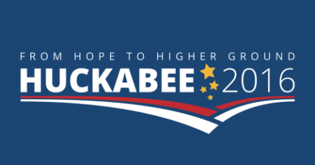
Good font choice and colors, but the the lines forming an off-center arrow pointing down are an odd way to describe the “higher ground” tagline. The stars feel a bit more playful than the overall design.
Shape: B
Color: A+
Font: A+

Donald Trump

Trump-2016
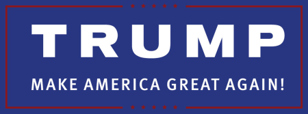
Conservative and rectangular, this logo could still work with a better font choice. The red color bleeds against the dark blue, which would have been an easy design fix.
Shape: C
Color: F
Font: F

Jeb Bush

Jeb-Bush-logo
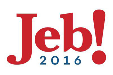
The Bush logo has a young, fun, playful vibe. It’s both simple and memorable. Good font choice and colors.
Shape: A
Color: A
Font: A

Rand Paul

Rand-Paul-Logo
Simple and bold. Great use of the negative space between the A and the N to create the base of the torch.
Shape: A
Color: A
Font: A

Ted Cruz

Ted-Cruz-Logo
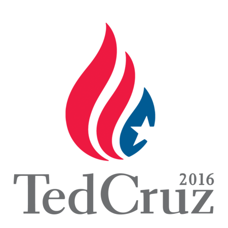
The shape of the icon is a little confusing: Is it a flame, or a burning flag? Also, the way the star is cropped is awkward, and the 2016 looks like an afterthought.
Shape: C+
Color: B
Font: B


July 13, 2015/by Gloria Lowe
Tags: 2016 election, bernie sanders, Brand, chafee, democrat, donald trump, jeb bush, jim webb, lincoln, Logo, martin o' malley, mike huckabee, presidential candidates, rand paul, republican, ted cruz
Share this entry
  • Share on Facebook
  • Share on Twitter
  • Share on WhatsApp
  • Share on Pinterest
  • Share on LinkedIn
  • Share by Mail
https://energyhill.com/wp-content/uploads/2015/07/13.jpg 1080 1920 Gloria Lowe https://energyhill.com/wp-content/uploads/2020/10/small-e100x100-3.png Gloria Lowe2015-07-13 16:33:162020-01-02 11:15:56Presidential Candidate Logos: A Design Review
You might also like
Training Sessions Built for Success Training Session Built for Success
IHOP Name Change - Marketing Stunt, Campaign, or Just Luck? IHOP Name Change – Marketing Stunt, Campaign, or Just Luck?

questions?

  • This field is for validation purposes and should be left unchanged.

instagram

it wouldn’t be a week without our regularly-sche it wouldn’t be a week without our regularly-scheduled yoga session. 🧘‍♀️🧘

@adrienelouise, our team thanks you for always delivering our weekly dose of grounding. 🤍

oh, and when we say “scheduled”…
it’s a weekly recurring event. on our calendars. that is STRONGLY encouraged. 🤗

NAMASTE! 🙏

#yogaflow #yogawithadriene #officeyoga
Hard work in the morning 👉 Afternoon pick-me-up Hard work in the morning 👉 Afternoon pick-me-up.

How do you get that afternoon boost of energy to make it through the day? Coffee, tea, or — dare we say it — soda? ☕️

#afternooncoffee #teatime🍵 #coffeeoclock #takeabreak #tampamarketing
organization isn't just another task on the to-do organization isn't just another task on the to-do list. it's a way of doing things. ✅

#projectmanagement #organizeit #tampamarketing
Load More...

follow

join newsletter

contact

800.959.1910
team@energyhill.com

5476 Land O Lakes Blvd.
Land O Lakes, FL, 34639

information

  • about
  • blog
  • careers
  • contact

case studies

  • Sigalarm
  • Go Mobile Flooring
  • The Citadel Military College
  • Admiral Farragut Academy
5476 Land O Lakes Blvd., Land O Lakes, Florida, 34639 | 800.959.1910
2021 © Copyright • energyhill • Terms • Privacy Policy
  • about
  • work
  • industries
  • services
  • blog
  • resources
  • contact
  • e
  • i
  • t
  • f
Do You Need a Shopping Cart? Probably. Website Shopping Cart Vendors vs Agency Multiple Vendors vs Agency Relationship
Scroll to top

Google My Business Package

  • What is your companies website address? From here we'll setup your QR code and more.

Epic!