A well-designed website is a massive advantage for any business. It can drive sales, boost exposure, increase loyalty, and promote your brand. These are only a few reasons why website marketing is crucial — but it can only work if you know how to design your website correctly.

Here are some strategies for website marketing and how they can help your business.

how website design can drive marketing

In order to effectively design a website that can operate as a marketing tool for business growth, you first need to understand website marketing. Website marketing is the method of using your website to promote your product and increase sales.

Different strategies include visually-engaging design, blogs, contact forms, email campaigns, and videos of products or testimonials. For example, including videos on your website has shown to enhance the customer experience and increases ROI.

website design is a marketing strategy

A well-designed website doesn’t just mean visually appealing, it includes engaging content, keywords, and search engine optimization.

About 44 percent of users will leave a website if it lacks specific information such as the company’s contact information. In addition, the website should tell a clear story that helps customers understand what you do. Incorporating strong SEO tactics in these processes will keep customers engaged and allows your website to readily appear on search engines, which is what every business works towards.

Your website provides an opportunity to track the performances of your marketing strategies, allowing you to see what’s working and what isn’t. Strategies such as including videos on your landing page can increase conversion rates, not to mention they leave a lasting impression on customers. Another popular strategy is to practice landing page a/b testing to increase conversion rates.

mobile-friendly website design

A vital, and often overlooked, part of website design is ensuring that it is compatible with different devices. Almost 57 percent of users have a negative impression and won’t recommend businesses that appear poorly designed on mobile.

An idea to consider is to create your website for mobile devices first, and then transfer to desktop. This may make it easier to connect the user experience to multiple devices.

take advantage of website marketing

make a goal

The first step of website marketing is really understanding what you want your website to do for you and your business.

Do you want to drive more traffic to your website or are you hoping for a more specific objective? You may find that you have multiple goals for your website, in which case you should prioritize that list. Rome wasn’t built in one day — so understand that goals all can’t be achieved at once.

Once you’ve created your goal then you can determine what tools and platforms will best allow you to achieve it.

target your audience

Create content for different audience segments on your site for the best result. The best rule of thumb is to generate content for three customer personas. The best way to do this is by analyzing your audience and what they are responding to.

Who will be coming to your website and what do they want? People have different values so for some, an established blog page with content represents credibility and leadership. However, for others, testimonials are a stronger selling point.

be design-savvy

First impressions matter. Your website is often the first thing that potential customers will see of your brand. It’s absolutely important that it’s well-designed and loads in a timely fashion.

Not only do you need to consider components like font and colors but customer accessibility. Pages should include a sales page where customers can purchase products or services, links to social media, an about page that shows what you do and sets you apart from other businesses, and more.

Customize these pages to fit the needs of your product or service. If you’re not confident in your design abilities, it’s worth it to outsource it to a reliable third party. After all, it’s the design of your website is the easiest way to make an impression on potential customers.

In addition to experience in web design and user experience, third parties also offer an outside perspective to bounce ideas off of. The investment in a great website will improve user experience, promote credibility, and boost sales.

award-winning web design

Do you need help creating a website or looking to revamp your current one?

When it comes to partnering with another company to handle your website design and marketing strategies, trust the award-winning experience of energyhill. Not only are our designs recognized, but we are also SEO experts and HubSpot partnersContact us today for a free quote on how we can help you grow your business.

TAMPA, Fla. — Mighty Carver, a unique electric knife invented by a Florida couple, was selected from over 37,000 applicants to present on Season 12 of ABC’s Shark Tank. Creative marketing agency energyhill, based in Tampa, Florida, led the marketing, design, and brand of the Mighty Carver to position the business for retail success since its inception in 2017.

Kim and Lance Burney, founders of the Mighty Carver, will appear on Shark Tank on Friday, November 6 for Season 12, Episode 4 of the Emmy Award-winning show where entrepreneurs pitch their products to business moguls and venture capitalists. The couple will present their electric carving knife shaped like a chainsaw, which is already sold internationally.

“energyhill was really instrumental with helping us from the very concept,” Kim Burney, inventor and owner of the Mighty Carver said. “Creating our brand from scratch was a big task. We couldn’t have asked for a better result.”

Mighty Carver Marketing

From the time the Mighty Carver began, energyhill positioned the brand to establish it as a first of its kind in electric kitchen tools. The creative marketing agency focused on the experience of families and friends using the Mighty Carver throughout the brand, design, and marketing

With user experience in mind, energyhill created the logo, brand collateral, package design, landing page, eCommerce store, photography, conference material, and an optimized Amazon product page. The Mighty Carver has since ranked as one of the best sellers in “Carving Knives” and “Electric Knives” on Amazon.

“We knew we wanted to be part of something that has the potential to bring people together for shared experiences,” energyhill president Dr. Ryan Lowe said. “We refined every detail of the design, branding, and digital presence with Kim and Lance until we got it just right. Ultimately, the aesthetics of the Mighty Carver and the brand aligned perfectly with the story, the experience, and the originality of the product.”

Shark Tank Pitch Preparation

Mighty Carver on Shark Tank

The Sharks for Season 12, Episode 4 are five of the most frequent on the show: Barbara Corcoran, Mark Cuban, Lori Greiner, Daymond John, and Kevin O’Leary.

To give them the best chance to secure an investment from one of the Sharks, energyhill prepared the Mighty Carver stakeholders for their pitch on Shark Tank. The marketing team developed accurate business reports leading up to the pitch, including financial forecasts, customer acquisition costs, sales projections, and more. 

“Everyone always says, ‘know your numbers,’ when you mention going before the sharks,” Kim Burney said. “We were able to rely on energyhill to provide pertinent business information so we were prepared for the pitch.”

About energyhill

energyhill was founded in 2013 in Tampa, Florida, by Dr. Ryan and Gloria Lowe. After decades of experience working in marketing including high-profile clients such as Walmart, eBay, and Best Buy, they created energyhill to be a marketing agency that’s different — one that prioritizes great design and puts the client first.

In 2020, energyhill won nine national marketing awards for their work in interactive brand experience, web design, mobile app design, augmented reality, print media, and video. You can learn more about the work they’ve done for clients on their website.

This has been a massive year for energyhill, a creative digital marketing agency in Tampa, Florida. It was an honor to win nine marketing awards from national and international organizations for our work in 2020.

The awards ranged across digital marketing campaigns, brand design, website design, app design and development, video campaigns, print media, and augmented reality. Our team worked tirelessly to bring brands to life through campaigns. Those campaigns were recognized for breaking through with poignant messages from four different organizations.

“Awards aren’t our goal, however it’s affirmation for what we do to help our clients,” energyhill President Dr. Ryan Lowe said. “The perfect win-win-win for us in any project is if it helps us grow, it’s profitable for the client, and if it’s award-worthy, which is just the cherry on top. … I know we do good work, but it’s gratifying that other people think so too.”

energyhill President Dr. Ryan Lowe

Of the 9 awards, four are Hermes Awards for video, print media, interactive brand experience, and mobile app. Two of the awards came from the dotCOMM Awards — platinum in business-to-consumer website and gold for innovative mobile app. Two others were from the Communicator Awards for website and web series, both recognizing work for our partner Renton Prep. Lastly, our video campaign for Renton Prep also won an NYX Video Award.

Hermes awards

Hermes Awards

energyhill was awarded one Platinum and three Gold awards from the Hermes Creative Awards.

First, we received the Platinum award in Video for our Renton Prep Stories campaign. The campaign’s mission was to feature stories of student success and opportunities at the K-10 school in Renton, Washington. In total, the campaign included 17 stories from the school.

“It’s easier to tell a story than create a mission statement,” Dr. Ryan Lowe said. “With Stories from Renton Prep, we took that element of graduates and some still in school and told their story for something that’s relatable. It can be fun for prospective families, and it’s good for the culture of the school.”

The first of our three gold awards were awarded in print media and design, recognizing our branded event materials for Sigalarm. In order to promote the brand at conference events, we created branded invitations, flyers, one-sheets, playing cards, bottle koozies, and event banners for the proximity alarm company.

interactive brand experience marketing awards

Furthermore, the second and third gold awards were for the interactive brand experience and app we created for Founding Fathers Fireworks. To begin with, energyhill handled the branding of Founding Fathers Fireworks, working closely with founder Kristy Hunnewell to achieve the company’s goals.

Specifically, that included web design, brand design, and app design centered around the augmented reality and history of United States Presidents through fireworks.

“Kristy’s vision was there, we just had to bring it to life,” energyhill Creative Director Gloria Lowe said. “It was very fun to start from the beginning when there’s nothing — logo colors, packaging design, branding, website, and then the app and augmented reality.”https://player.vimeo.com/video/347582218?dnt=1&app_id=122963

DotCOMM awards

When we started working with client Griffin Pools this year, their fantastic pool constructions in Central Florida were buried behind an uninspiring website and inconsistent branding. However, with great work comes massive potential. energyhill created a new set of brand colors and freshened up their website with an entirely new, modern design and improved SEO.

The project was recognized with a Platinum Award from the dotCOMM Awards for excellence in website redesign (business-to-consumer). Coupled with an interactive tool to generate leads for the Lakeland-based pool company, Griffin Pools has far exceeded their expectations for leads.

Additionally, energyhill won a Gold award for our work on the previously mentioned Founding Fathers Fireworks mobile app.

Communicator awards

Both submissions to the Communicator Awards stemmed from our work with Renton Prep. Our Renton Stories campaign was recognized with a Gold Award of Excellence for Campaign or Web Series.

Additionally, we were awarded a Silver Award of Excellence for our website redesign for Renton Prep. At the start of our relationship, our team started working with Renton Prep with a website redesign. This included both in visual design and content organization for SEO. Notably, the redesign met the school’s goals to position them as an established technology-first school and greatly increased traffic to the website.

“Renton Prep is naturally content-driven, putting out great content from an educational standpoint. However, they weren’t doing it on their website,” Dr. Ryan Lowe said. “We decided, ‘Let’s open this up across the board,’ and that’s where they became a Microsoft Showcase school and it certainly helped achieve all the goals they had.”

NYX video award

Finally, we wrap up our awards with an NYX Video Award for our Renton Prep Stories series. NYX Awards are for the best visual creative ideas from around the world. As noted before, this campaign’s goal was to highlight students’ successes and opportunities at Renton Prep.

creative marketing that inspires

Behind all of our projects is the same creative energy to build inspiring experiences that exceed our partners’ goals. We’re so proud that our work was recognized among the best of the best this year. But moreover, we’re excited to help organizations consistently reach their business goals.

Are you looking for an award-winning marketing team to help your business grow? We’re here for you. Contact us today, and let’s build an award-winning experience for your business.

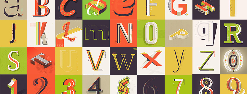
Arguably our favorite time of year at energyhill is when 36 Days of Type comes around, and our talented team of designers is able to get creative with this daily social media challenge. Last year, our team tackled the theme of the World's Fair of Typography. We each took on a different country and tried to convey it through our assigned letter or number. This year, we went with the theme of font history, to share our love for typeface design and its origins.

the 36 Days of type reputation

This is year seven of 36 Days of Type, and the hype has never been stronger. The project is based out of Barcelona and now has a partnership with Adobe, which has exploded its popularity even further. This year, Adobe is encouraging designers to experiment with AR, animation, and 3D art forms.

Through the hashtag #36daysoftype, judges choose the most impressive letters and numbers. This results in a social media feature, or for six lucky winners, a free one-year Creative Cloud subscription.

The stand-off with instagram

Marketing experts are constantly trying to stay on top of the latest Instagram algorithm. Instagram is currently looking for authentic, active social butterflies and blocking bots and spam accounts. Engagement, frequency, and communication are key to ensuring your account appears frequently to your followers, . As long as you don't overdo it.

Due to Instagram's ever-changing algorithm, this year's edition faced some issues. The platform is their main source for resharing content and featuring the work of designers. But because there was so much engagement from the account, Instagram called it out as spam, and blocked them from posting. This resulted in a brief hiccup for the challenge, which has thousands of participants across the world.

https://www.instagram.com/p/B9TstC7ISLY/

36 days of font history with energyhill

How much do you really know about Helvetica? Or Times New Roman? Going educational with our theme this year meant attempting to educate the public––and ourselves––on the origins of many well-known fonts.

We explored the depths and origins of Comic Sans, Arial, Papyrus, Futura, and more. Here are some interesting facts we found out about some famous fonts:

incorporating new brand colors

This year, the team wanted to keep the letters set cohesive. We recently updated our brand colors, so it was the perfect opportunity to incorporate it into the design. And although we put restrictions on the project, it didn't stifle the creativity of our designers. Everyone's unique style still came across, and patterns appeared throughout everyone's letter set.

unique results for your brand

Our approach is simple: creating an authentic voice for your brand that connects with your audience. Our design services result in beautifully crafted experiences for your audience and create the foundation from which to launch your business. Learn more about our design services and how we can help your business grow.

Why do colors affect the way we feel? There's a reason that people feel more depressed in the winter than they do in the summer: the absence of light. Color theory is constantly used by companies to elicit specific reactions from customers, whether it's excitement, relaxation, hope or happiness. It takes most people 90 seconds to decide whether they'll buy a product, and 90% of that choice is based on color.

What is color theory?

Put simply, color theory is the science and the art of mixing colors. Most of us know the terms primary, secondary, and tertiary colors. We've heard of hue, tint, shades, and complimentary colors. But how do we go from this basic knowledge to choosing a legendary color combination that wins over our audience? Generally, these are the emotions evoked by certain colors:

These are the common emotions, but note that not everyone will perceive colors in the same way. Their background, culture, age, and upbringing will all influence the meanings they assign to certain colors. That's why this next point is imperative to choosing the best color palette for your brand.

Know your audience

It always comes back to the people who will buy your product, visit your website, or follow your social account. Always design with them in mind. Before you start throwing together colors, remember who you're designing for and how you can best grab their attention. It might be helpful here to create buyer personas so you can better identify those who might be interested in your product or service. Also, always make sure your color palette aligns with your company's purpose.

Creating color combinations

Once you have your company's purpose down and your audience defined, it's time to set the mood. Here are some common color combinations that stem from color theory.

analogous colors

Analogous colors are adjacent to each other on the color wheel. The result is a harmonious and natural look.

complimentary colors

Complimentary colors are pairs that are directly across from each other on the color wheel. They usually create a strong contrast and grab one's attention.

triadic colors

To choose a triadic color palette, pick a color and draw an equilateral triangle. These combinations tend to feel well-balanced.

monochromatic

Monochromatic colors are very "in" right now. It involves choosing a color, then adding various shades of white and black.

What about those fancy color terms?

You should definitely know the difference between color, hue, tint, tone, and shade. They're actually a lot simpler than we think.

Tools to help you choose

You're not alone in this; there's inspiration everywhere. Pinterest or Behance are great places to start and see what kind of look you want to go for. You can also use online tools to help develop your color palette. Adobe color wheel is great for extracting colors from an image, or starting a palette from scratch. Color hunt is great for design inspiration, if you want something a little more readily available. Coolors generates color palettes at the touch of a space bar, and Color Supply is a nice traditional method for choosing as well.

Rebrand with energyhill

Is your brand looking for a breath of fresh air? Check out our services and set up a free consultation to get started.

Over the years, energyhill has evolved a lot as a company. We removed the iconic red and white from our website a while ago. And replaced it with a charcoal gray and a vibrant gradient just last year. As our colors began to feel a little dark, we decided to do a brand refresh to kick off the new decade.

energyhill's past color palettes

Previous color selections reflected different times in the company's past. The red and white evoked the passion and clarity with which the company was started. The charcoal/gradient combination symbolized an important transition period for our brand. This year's colors are a confident selection to better express our voice and messaging.

2020: energyhill brand refresh

For a brand new decade, we wanted to keep some traditional elements while completely revamping others. Drum roll please... here are our new colors!

"grapefruit" is a great way to maintain the vibrant energy (pun intended) evoked by the red and gradient, but in a more modern way. We chose to keep the charcoal and replace white with a subtle ivory color, similar to the powdery white sand that Florida beaches are known for. "eggplant" is a nice modern accent to "grapefruit", and "cafe con leche" is a way to incorporate a pastel and tone down the intensity of the other colors (as well as express our love of coffee!).

the process

Our designers first determined what tone would match the brand. Here are the words they came up with:

From there, our designers gathered inspiration from a number of online resources and started making combinations that included a red base or the charcoal. Here are a few of our sample color palettes from which we narrowed it down:

Although we liked the tropical feel of sets 5 and 6, we felt the green would be a little too off-brand. Option 4 was a bit dark for what we were going for, and 3 just didn't feel as cohesive as 1 and 2. It was a tough choice between 1 and 2, and they are almost exactly the same, but after much debate, we went with choice #1!

new year, new look

Brand refreshes bring with them new expectations of a company, refined messaging, and more specific goals. This year and this coming decade, energyhill's services are transforming to make sure companies can stay afloat in this fast-moving technology world.

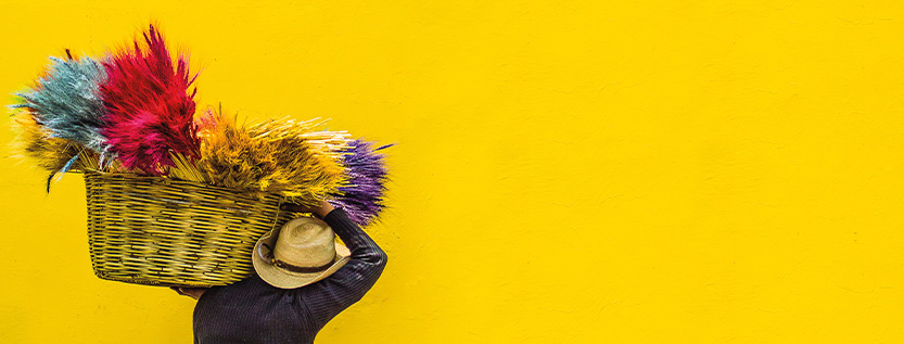
Every year since 2000, Pantone has chosen a color to reflect the current social, political, and environmental state of the world. Last year's color was Living Coral, a reference to the ocean's rapidly dying coral reefs. This year they've chosen 19-4052 Classic Blue, to evoke a sense of simplicity, tranquility, and confidence heading into this new decade.

We are living in a time that requires trust and faith. It is this kind of constancy and confidence that is expressed by PANTONE 19-4052 Classic Blue, a solid and dependable blue hue we can always rely on... A boundless blue evocative of the vast and infinite evening sky, Classic Blue encourages us to look beyond the obvious to expand our thinking; challenging us to think more deeply, increase our perspective and open the flow of communication.

Leatrice Eiseman, Executive Director of the Pantone Color Institute

Blue in Color Theory

What does the color blue remind you of? A calm ocean? A clear sky? The corporate ladder? Although the primary color can have these connotations, it can also mean reliability, energy, and strength. The image of a sky at dusk comes to mind, a symbol of "crossing into a new era."

Color matters. It's an essential component of marketing and design, as it can put your audience in a specific frame of mind while they're absorbing your content. A darker blue is said to evoke trust and authority, while lighter shades express peace and spirituality. For example, the color blue can be used for a brand wanting to label themselves as professional; or maybe as a calming choice for a meditation app.

Blue is a very versatile color and has many different meanings across cultures. Definitely do your research if it's something you're interested in using.

Calm is a meditation app that uses blue as its major brand color.

our designers' thoughts

GLORIA, creative lead: As we enter a new decade I see why Pantone picked classic blue hue for their color of the year 2020; they are going back to the beginning, to their first color of the year 2000..."cerulean blue" a lighter and powdery shade of blue. That also represented calmness and tranquility. Personally I don't like blues, but I understand the meaning behind why this color was chosen and also think was the right choice for this color to represent this new century!

NATALY, sr. graphic designer: My first thought was, why? That color has always felt to me representative of corporations and businesses. After I read the intentions behind choosing this color, I definitely like it a lot more. I like that it reminds me of dusk. Is it non-aggressive and easily relatable? I don't know; I don't really get that aspect of it. But it's definitely calming, peaceful and deep.

LISA, jr. graphic designer: Classic Blue, the ocean and the starry blue sky color gave me a sense of peacefulness and calmness. It is more of an educational color, but thinking how this color will work throughout the year, I don’t think is too bad. Since the 2019 color represented energy, the 2020 color might give the design industry a feeling of security, calmness, and serenity.

Pantone has always preferred to take the positive view on every color they choose, no matter how daunting the reason behind it. Last year's Living Coral was an active choice to showcase a world we all want, instead of emphasizing the bad. This year's Classic Blue is a comforting end to the decade and a restful start to the new year.

What do you think of this year's Pantone color? Let us know in the comments!

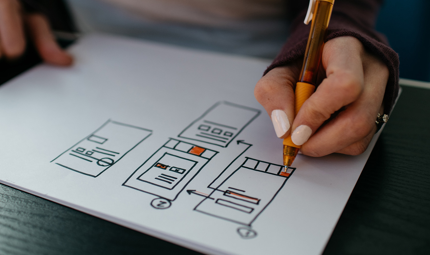
In the ever-changing industry of marketing, it's easy for a brand to get left behind. Staying on top of the latest trends and staying aligned with an audience requires constant self-analysis and research. Take it from the big brands; they're continually morphing their look and messaging to stay current and maximize their reach. But how do you know whether your company needs a complete rebrand, or a brand refresh?

It's important to always keep an eye on the market to determine whether or not it's time for change. However, rebranding is not always necessary. Instead of planning a complete overhaul, sometimes all companies need is a refresh to reflect the ongoing changes in the industry.

Throughout the years, Starbucks has refreshed their look to stay relevant.

When Do I Refresh?

A brand refresh involves keeping the bones of your company the same and simply giving the surface a good makeover. Usually when your brand feels like it no longer stands out, it's time to revisit your marketing tactics and find out what's not working. You can also tell by your sales whether or not it's time to refresh. Consider a refresh if:

How Do I Refresh?

A refresh can be thought of as a spring cleaning for your brand. Take a look at your messaging, color palette, images, videos, website, and logo. Sometimes all it takes is fine-tuning your slogan and refreshing your marketing materials. Choose a new font, tweak your current logo. Don't worry about revamping your entire image.

Buzzfeed's rebranding made them look more like a quality news source.

When Do I Rebrand?

Sometimes when you opt for rebranding, you risk doing more harm than good. Pulling off a successful rebrand requires a lot of planning and research. You have to create an entirely new brand "personality" and possibly go into a different market than before. Consider rebranding if:

How Do I rebrand?

Rebranding is all about changing the way your audience sees you. In order to do that, you need to really determine what you want to accomplish with your rebranding. Setting a clear goal helps to steer you in the right direction. Examine your competition, but don't copy them. Focus on what makes your company unique and build a new identity based on the core values of your business.

energyhill branding services

At energyhill, we help businesses find their voice or just freshen up their current one. We understand the changes in the industry and advise the businesses we partner with accordingly. If you are looking to modernize your brand's identity or are looking to start from the ground up all over again, contact us to get the conversation started.

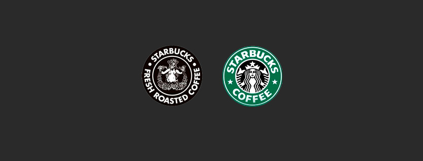
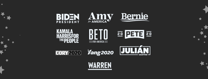
It’s that time of year again… Time for the presidential candidates (and their logos) to go head to head. The energyhill team discussed 10 democratic presidential candidate logos and gave them each a grade for their layout, color, and font.

Amy Klobuchar

Klobuchar's logo uses too many fonts and colors to be pleasing to the eye. The green is an unusual choice for a presidential candidate, and doesn't evoke the patriotism that the other logos achieve. The serif font of the "Amy" looks nice and well-balanced, but clashes with the other two fonts, which individually are actually nice fonts. The designer mixed too many components together, without worrying about how everything flows.

Layout: C
Color: C
Fonts: C
Overall: C

Beto O'Rourke

Beto's logo is in black and white, which is untraditional. This combined with the font choice makes it look modern and minimalistic (Top Gun, anyone?). However, it doesn't feel colorful or patriotic enough, and is too bold and condensed. 

Layout: A
Color: C
Font: A
Overall: B+

Bernie Sanders

Bernie's logo is the same as his 2016 logo, without the year underneath the name. The blue and red lines create a nice sense of movement (although it is reminiscent of toothpaste). The star over the I is a nice touch, the kerning is perfect and the fonts are well done.

Layout: B+
Color: B+
Font: A
Overall: A-

Joe Biden

Biden's logo is simple, bold, and beautiful. The D working into the E to turn it into a flag is a clever touch. The fonts and spacing are on point and there is good color choice and contrast. This logo pops among the others.

Layout: A
Color: A
Font: A
Overall: A

Pete Buttigieg

Buttigieg's logo is unconventional, and not in a good way. It's similar to a college football banner because the 20's are split, so it just looks odd. The font doesn't work, because the P and T aren't slanted as much as both E. Overall, it does a poor job of getting across a patriotic message.

Layout: B-
Color: C+
Font: B-
Overall: C

Cory Booker

Cory Booker's logo is arguably the least impressive of the bunch. Because of the rectangle around the text, the logo feels too tight and boxed in. The fonts and colors are similar to the Marvel logo, and the black and blue combination bleeds horribly. On a business card, this would be very difficult to read. His logo is similar to Tim Ryan's, though Ryan's is slightly better because they didn't use black.

Layout: D
Color: C
Font: C
Overall: C-

Julián Castro

The colors are wonderful, but the JULIAN might be a little too bold compared to the weight of the border. The accent mark through the border is a nice touch and adds dimension to the layout. The "Castro" feels like it's sort of jammed in, and the logo would have had better spacing and composition without it. This logo is still pretty great, and needs very minor edits.

Layout: A
Color: A
Font: B+
Overall: A

Kamala Harris

Purple and orange are a strange choice for a presidential candidate. There is no hierarchy in this design, since "for the people" is in a brighter color than "Kamala Harris," but "Kamala Harris" is first. The stacked look doesn't work, and is similar to the branding of Morgan and Morgan (a Tampa Bay local attorney's office). There is some potential to work with the white space, but it serves no purpose in this design.

Layout: C
Color: C
Font: A
Overall: B-

Elizabeth Warren

Elizabeth Warren's logo is simple, sharp, and straight to the point. The font is beautiful, but the color is up for debate. It looks great when it's knocked out to white and laid over another color, but it can look sort of boring in the simple navy blue. The kerning is great, although the underline extends a bit too far out from the N. Overall, this design is fairly strong and would look great on a business card.

Layout: A-
Color: A-
Font: A
Overall: A

Andrew Yang

There are a lot of different things at play with Andrew Yang's logo. First of all, the flag over the Y doesn't really work because the letter can easily be confused for another letter like T or L. Scaled down, this logo would be very difficult to read. There is a sense of movement with the slanted text, but the type should have been uppercase to make the "Yang" stand out more than the 2020. They could have worked wonders with such a short name, but unfortunately this logo doesn't quite hit the mark.
Layout: B-
Color: A
Font: A
Overall: A-

What makes us creative? It may be the way we approach circumstances or provide solutions to issues. Or it may be the way we concoct a new product using different parts and making them work as one. Whatever it is, as humans, we grow up naturally curious; but as we get older, our creativity is slowly stifled through mundane jobs, health problems, or bills to pay. So, we spend years trying to recapture the effortless creativity of our youth, which now seems to only belong to innovative geniuses or renowned artists. But do not despair because there are a number of creativity myths that show us that not all is lost. Creativity belongs to everyone, not just the select few.

Creativity Myths

The good news is: not everything we believe about creativity is true. It's not just a product of an inspirational upbringing, and it can be used in every aspect of our lives. The following creativity myths give us hope that it is possible to be creative and there's no specific formula to attain it.

Myth #1: Ideas Will "Come to You"

We sometimes sit around hoping that the clouds will open up and the perfect idea will float down from the sky. Unfortunately, that belief leads to a lot of wasted time sitting around and doesn’t encourage productivity. We can't expect wonderful ideas to pop up in our dreams, either. The famously described “eureka” moments usually happen after hours spent deliberating on a problem. In other words, it’s not magic, it’s your subconscious!

Myth #2: Creativity Is Genetic

How could creativity possibly be passed down through your DNA? No data has been found to support this theory of a special "creative gene." Creative people have been found to emerge from totally non-creative walks of life, the same way that some children in artistic families might lack the qualities themselves. It's something we can seek and acquire at any stage in our lives, proving we're committed to the task.

Myth #3: Ideas Are Owned

Although some lawyers might argue this, ideas are not proprietary. Since the beginning of time, people have shamelessly copied off each other and developed their own original spin on ideas that already exist. Ideas are constantly recycled in different ways and given a fresh look. There’s no shame in this, and it doesn’t make you any less creative. Therefore, being able to look at a product or service and determine what it lacks so that a better version can be created is what business is all about.

Myth #4: Creativity Is Only About Art

Contrary to popular belief, creativity can come in all shapes and sizes. You don't have to be a Picasso or Beethoven to preach about creativity; you can find it in anything from scientific breakthroughs to politics. So, if you're brainstorming non-traditional solutions to common problems (design thinking), you're being creative, whether you're Beyoncé or Stephen Hawking.

Myth #5: Creativity Can’t Be Learned

As humans, we're all born with some natural amount of curiosity and creativity. Children are always asking questions and exploring their surroundings. As we grow older and learn about the world, our creativity and curiosity fades, but that doesn’t mean we can’t relearn our old way of thinking. Thankfully, you can learn to be creative at any point in your life, as long as your way of thinking is challenged and pushed to create solutions.

Creativity = Create (Duh)

It’s difficult to pinpoint exactly where creative tendencies arise (nature vs. nurture), but we do know it’s not something to rely on your DNA for. We also know that creativity can be learned (it's not too late!), ideas are constantly stolen and recycled, and they most definitely will not float to you in your dreams (unless you're so obsessed with solving a problem that you're dreaming about it; in that case, dream on). At the end of the day, creativity is about creating, no matter what your passion is.

energyhill Creative Marketing

At energyhill, we work to put creative solutions into practice for businesses. Our marketing, brand, and design services help companies stand out and thrive. We give your brand the voice is needs to find and connect with your audience. Contact us for a consultation.

linkedin facebook pinterest youtube rss twitter instagram facebook-blank rss-blank linkedin-blank pinterest youtube twitter instagram